Our next Artist You Need To Know is Jaan Poldaas (1948-2018).
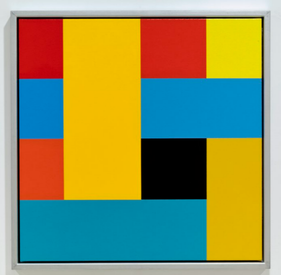
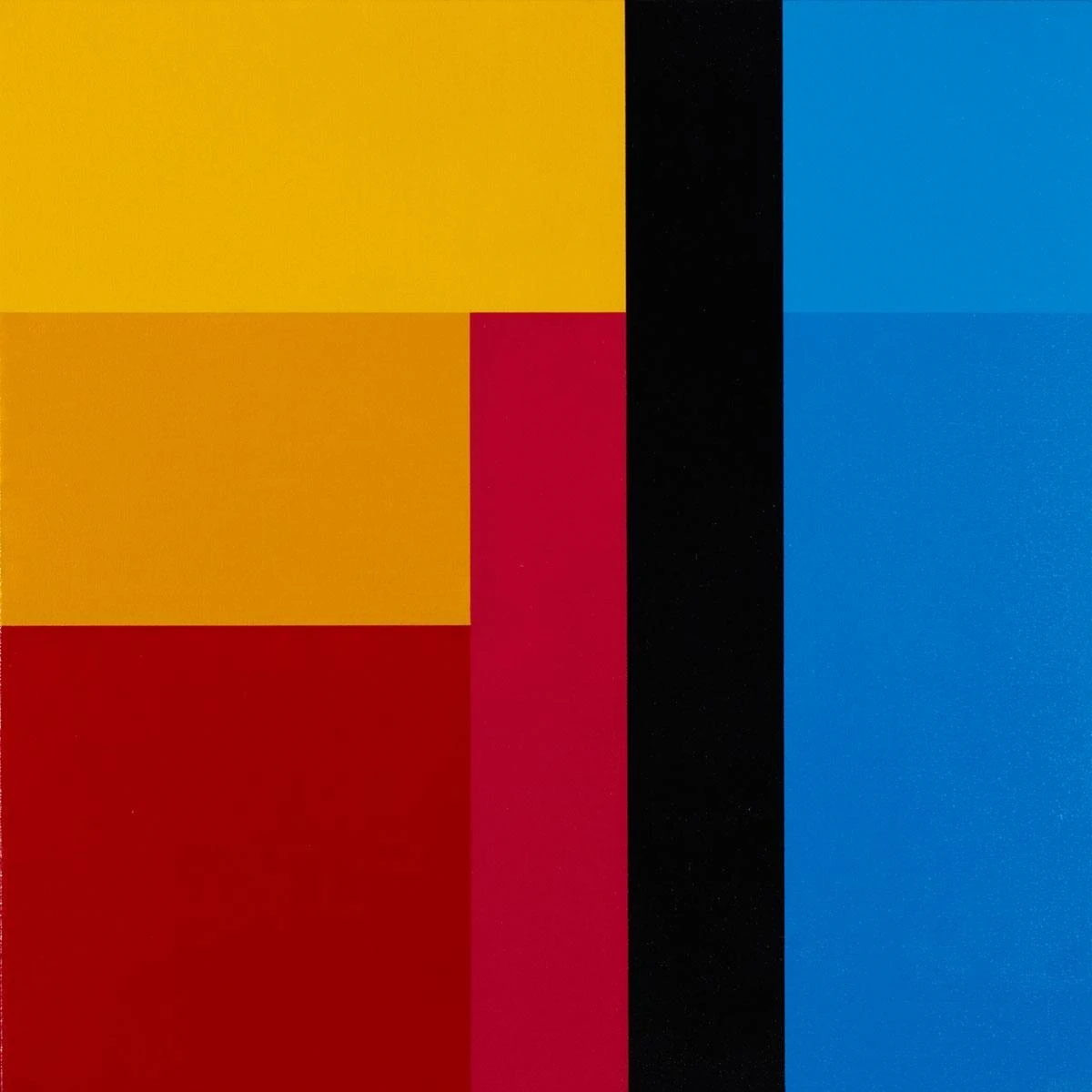
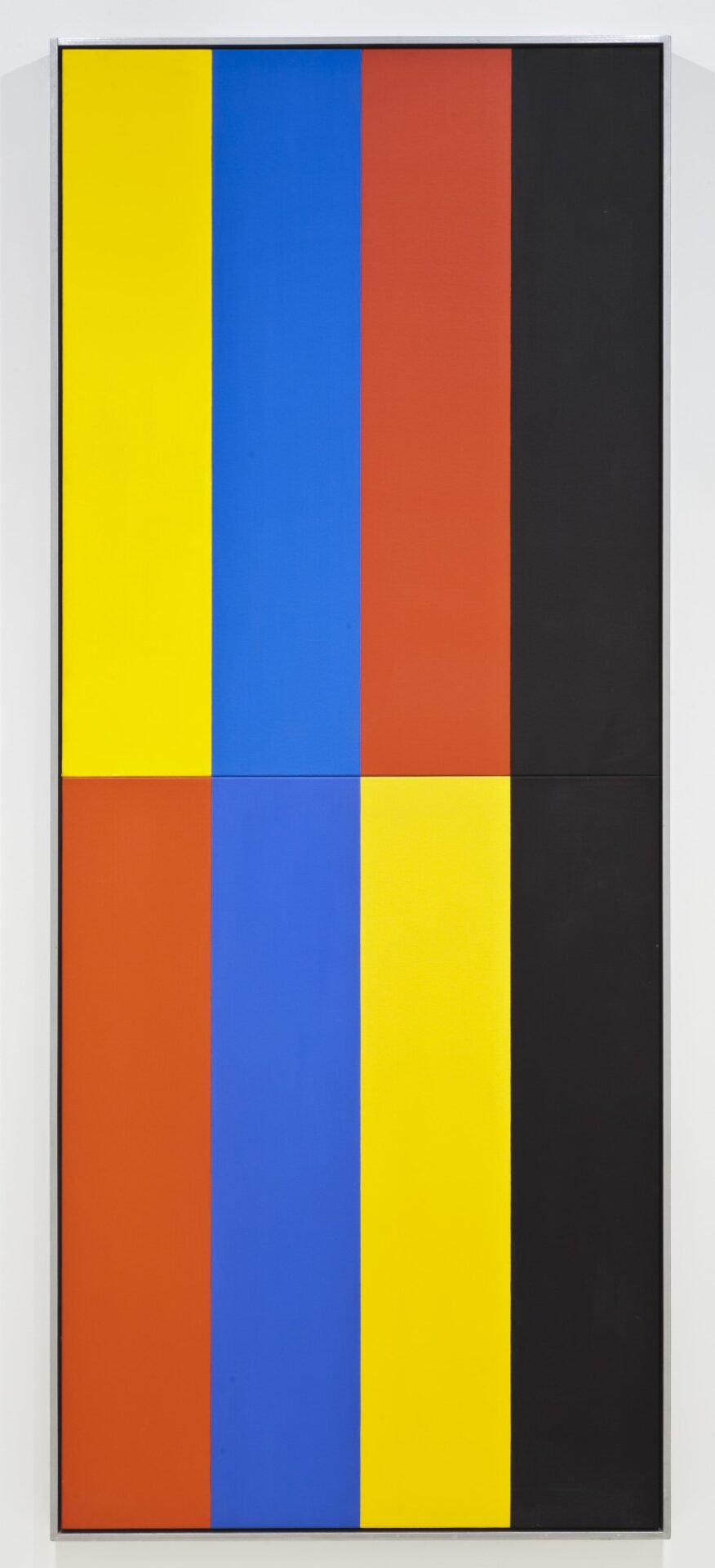
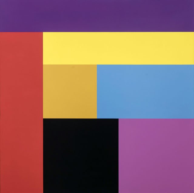
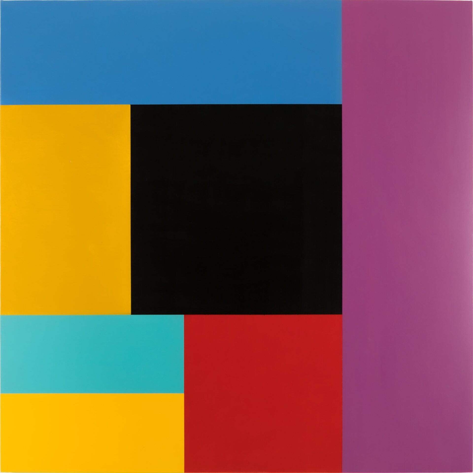
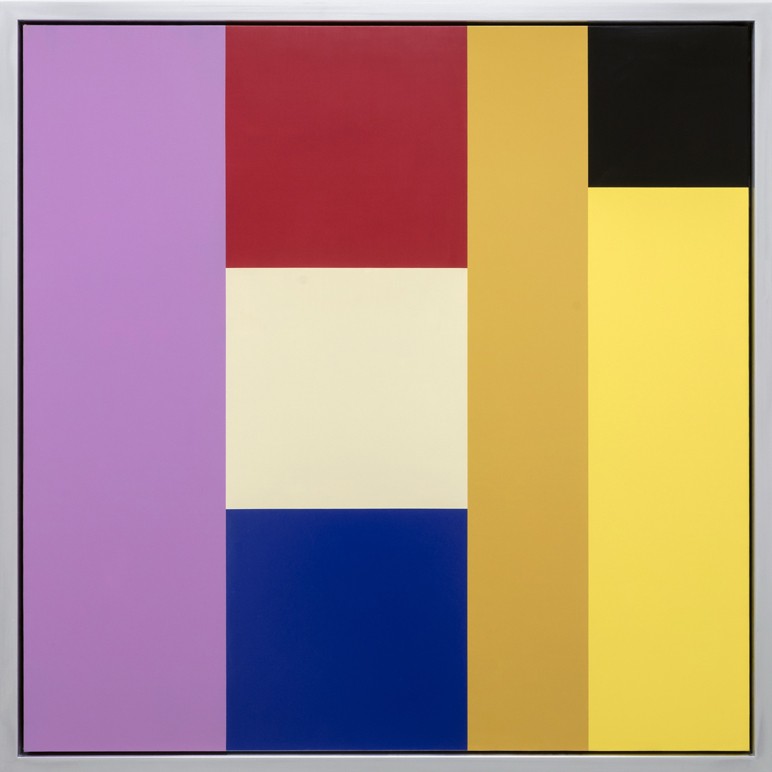
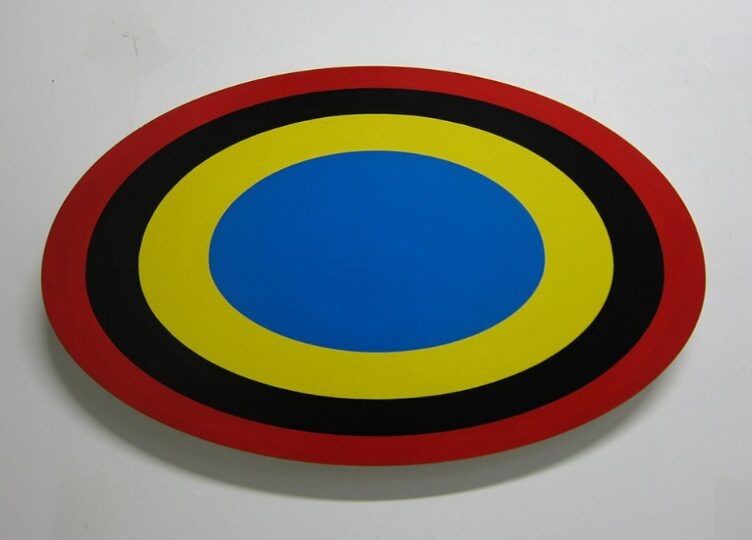
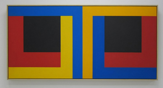
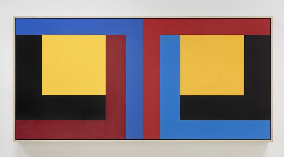
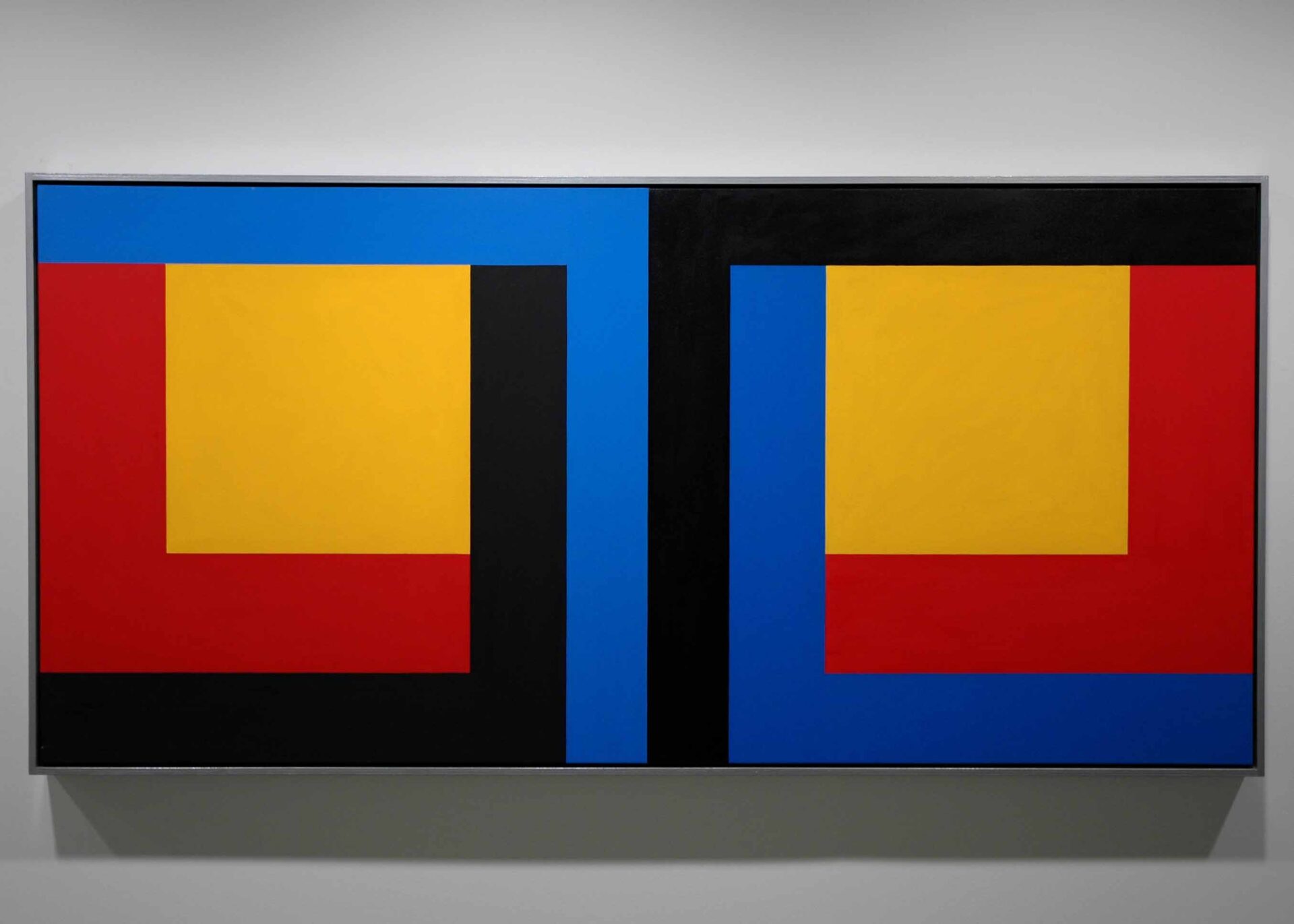
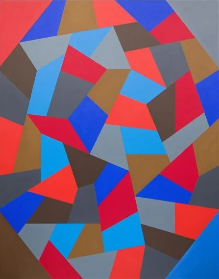
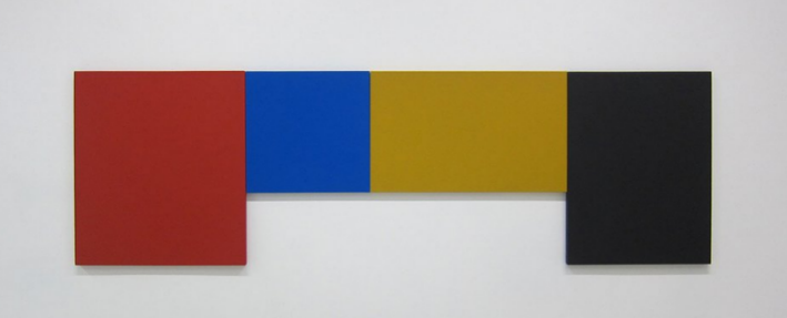
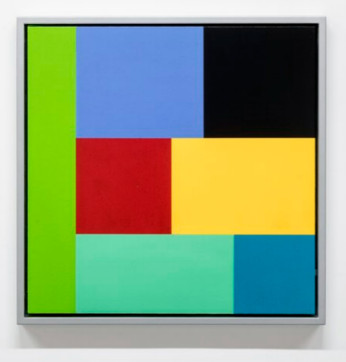
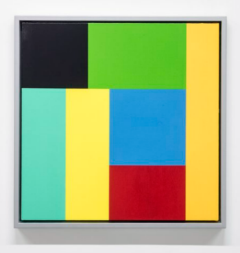
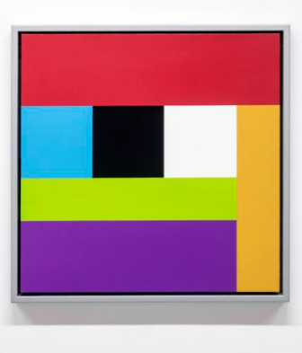
Poldaas was a painter best known for his hard-edge abstract painting, both in his prolific production and as an advocate for this art form. Since the 1970s Poldaas’ “sophisticated and rigorous conceptualist and process-based ideology and his distinctive chromatic personae set him apart from his peers in the Canadian school.” (from Birch Contemporary)
He was born in Sweden in 1948 and his family emigrated to Canada two years later. Poldaas grew up in Northern Ontario : he studied architecture at the University of Toronto (1967-1970) before turning his attention to painting. A founding member of Mercer Union Artist Run Centre (1979) as well as an active member of both the Artist’s Co-operative Toronto (A.C.T., 1975 – 1979) and Cold City Gallery (1986 – 1988), Poldaas was a significant artist in the Toronto painting milieu.
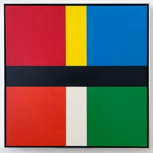
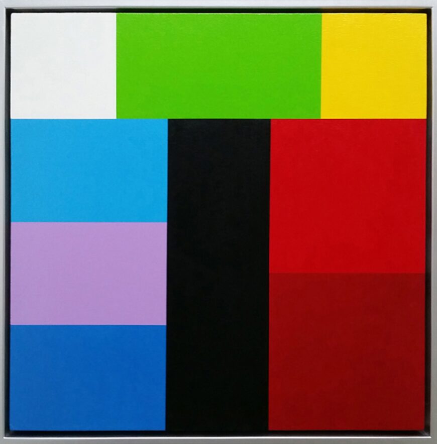
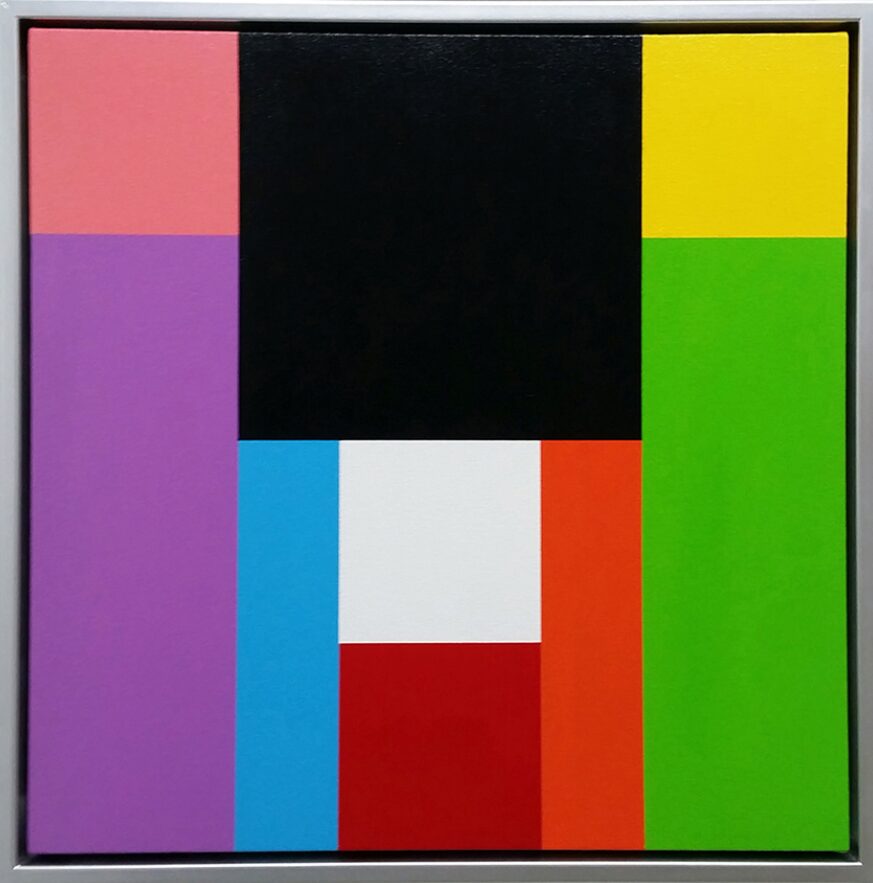
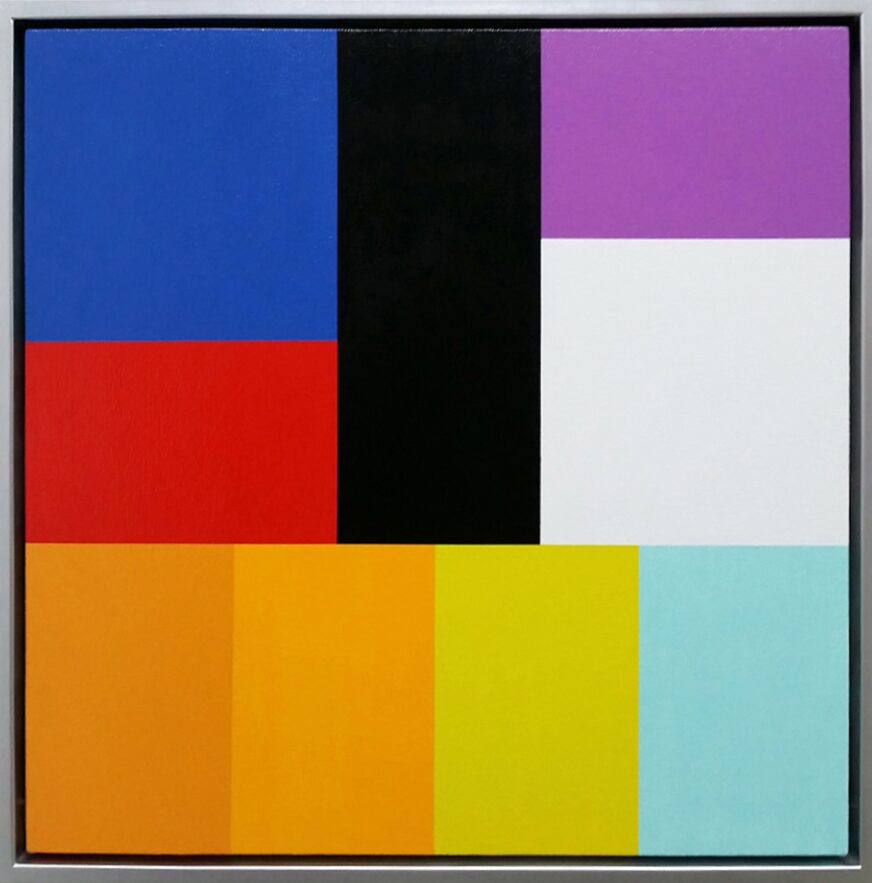
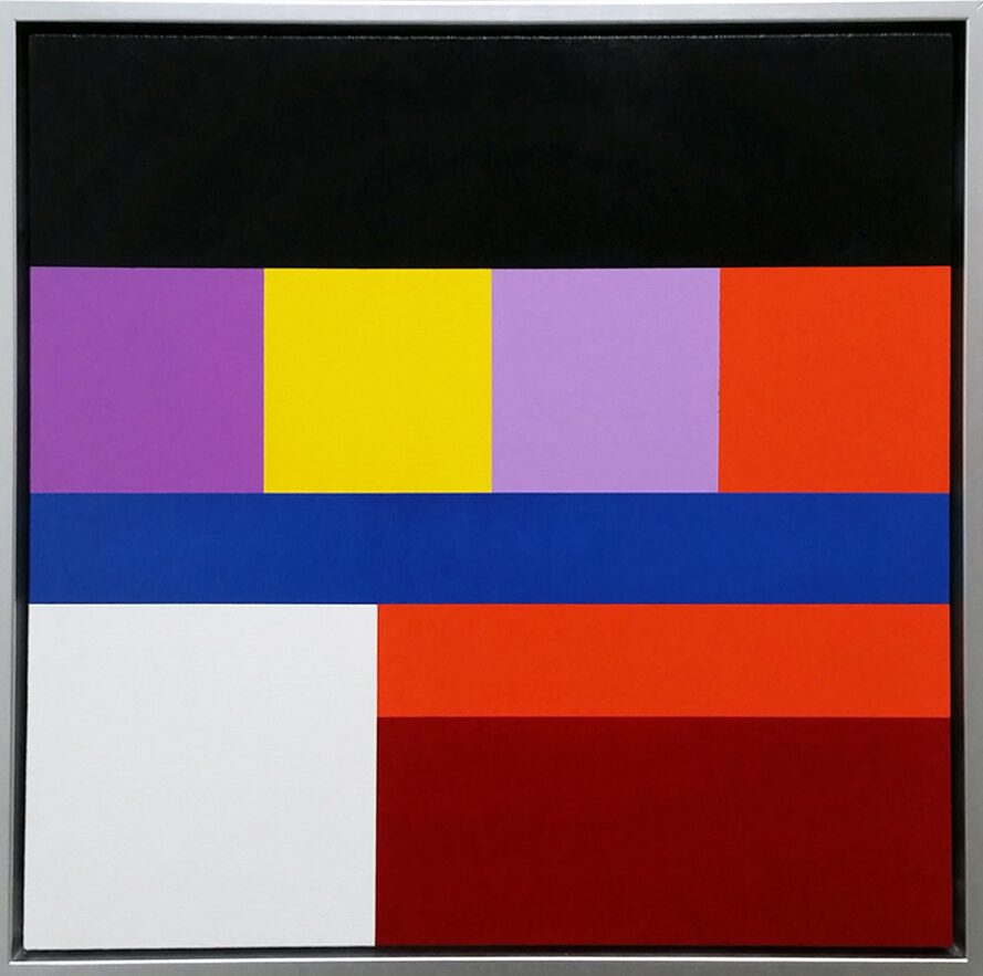
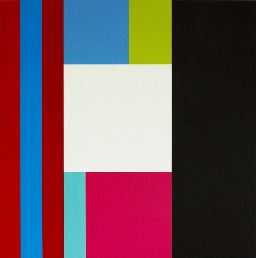
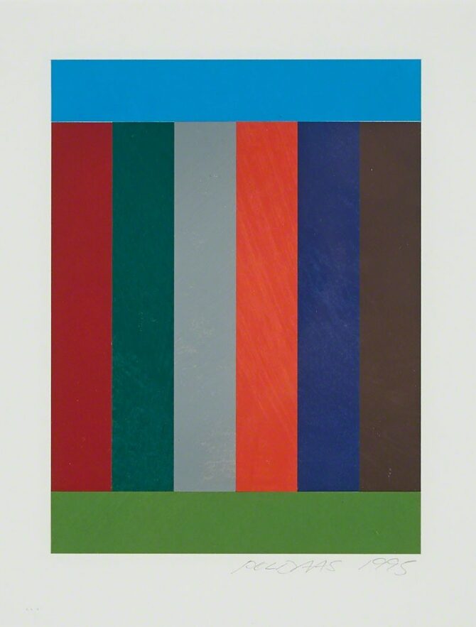
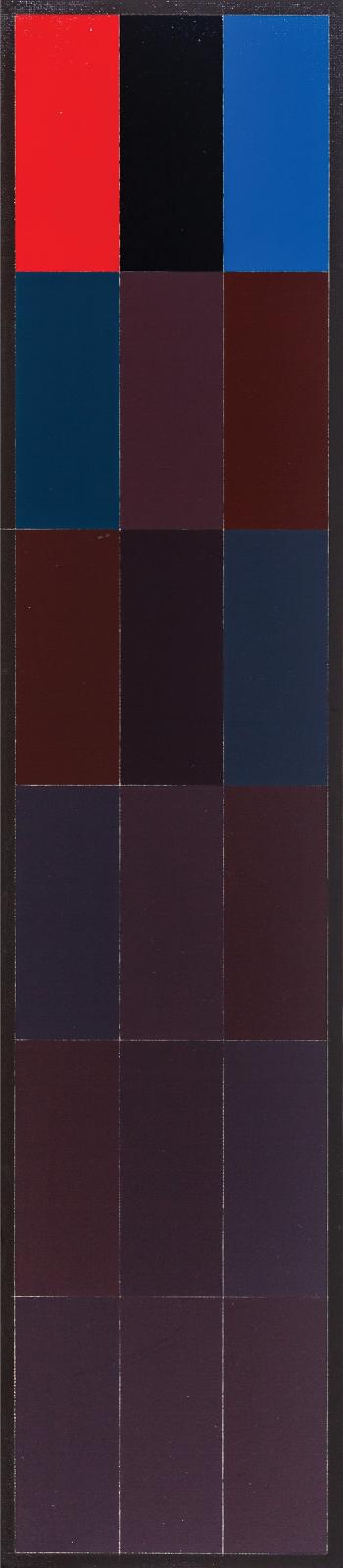
From the text for the exhibition Jaan Poldaas: 2018 The Last Pictures Show and 30th Anniversary: TTC Commission Proposal Studies at Birch Gallery : “Poldaas creates a program of self-imposed rules to determine a work’s geometric and colour composition. In his book, Abstract Painting in Canada, Roald Nasgaard includes a section on Poldaas, in which he states, “Poldaas’ strategy has been to find objective and rational criteria by which to examine the function of colour, to deal with its materiality within conceptual frameworks and to subvert all tendencies towards subjective or decorative selection. “I have actively pursued an understanding of colour in a way that no other artist has to my knowledge, and this has not been devoted to mastery. To be a master you have to stop thinking about it.””
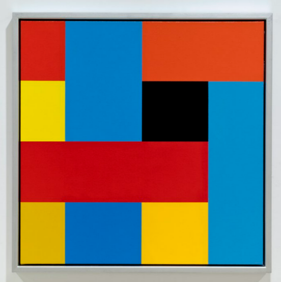
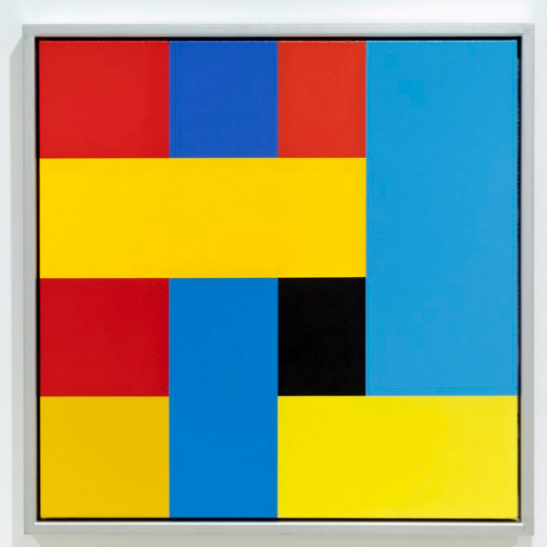
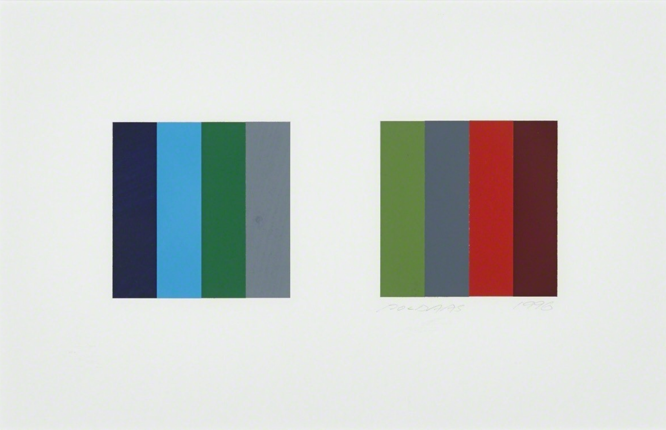
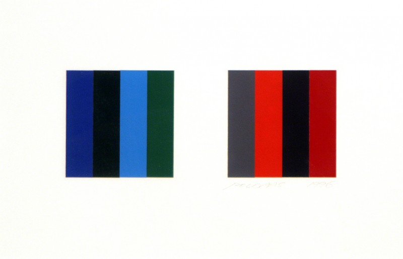
As Poldaas’ aesthetic was rigorously defined by colour this led to him changing how he titled his work, shifting to a numeric system that platformed this approach in the names themselves.
For example, starting in 2010, Poldaas began using a number code to title his paintings : “The first 2 digits indicating the year and the last 2 the number in the series. But in 2016 he decided to start naming his paintings according to a syllable system in which spectral hues were assigned a consonant – for example P for purple – and lightness value a vowel from black to white – so Pu, Po, Pa, Pe, to Pi- resulting in paintings with rediculous names such as: Jikurane, Kulibase or Bapeneli.” This information is from here, and more about Poldaas’ system for titled his work – always in the service of colour, hue and tone – can be learned there.
More from Roald Nasgaard : “Colour for Poldaas was ‘a separate attribute’ to focus on, much in the same way that Richard Long was concerned with length [and] Richard Serra with weight…”
Important solo exhibitions of his work have been mounted at Wynick/Tuck Gallery (Toronto, Ontario), Costin & Klintworth (Toronto, Ontario), Mercer Union, (Toronto, Ontario), 49th Parallel (New York City), Anna Leonowens Gallery (Nova Scotia College of Art and Design, Halifax), Optica (Montreal, Quebec), Glendon Art Gallery (York University, North York, Ontario) and A Space (Toronto, Ontario).
Recently, a major exhibition of his work was presented at Robert Birch Gallery in Toronto : you can see more about that fine testament to Poldaas’ life and work here.
Poldaas’ work can be found in numerous public and private collections (both in Canada and internationally). These include the Art Gallery of Ontario, the National Gallery of Canada, the National Gallery of Estonia, Agnes Etherington Art Centre, Art Gallery of Hamilton, Vancouver Art Gallery and the Albright-Knox Art Gallery.
A more detailed list of his exhibitions and accomplishments can be seen here.
Many people are familiar with Poldaas through his four large works Passages as Endpoints and Pauses (each panel 101 x 101 inches, 2014) which was commissioned for the Mies van der Rohe tower on Bay Street in Toronto.
Jaan Põldaas passed away on October 17, 2018.
An impressive series of images and installation shots of his work can be enjoyed here, from the aforementioned exhibition at the Robert Birch Gallery in Toronto. A brief video about that exhibition can also be seen here.
We also encourage you to follow this account on Instagram : Poldaas’ stepdaughter administrates it and not only offers some fine images of his work but also wonderful insights regarding his use of colour and titles that only enhance the impact – and enjoyment – of the work. Several of the ideas shared in this post are taken from that page.